Thursday, December 19, 2013

3-D paintings

Motivation 

Our main goal with this project was to figure out what it would take to convert a 2-d painting into a 3-d painting. There is a lot of thought that goes into the composition of a 2-d painting and the artist has a reason for each choice he/she makes, from deciding the composition to choosing the colors, to deciding how to layer the textures. In effect, the artist conscientiously  selects what the viewer sees. For example, here's a an abstract painting from 1935 by Paul Klee: 


      The artist chose to paint the figure face on, decided to fracture the image into pieces. Even though it looks deceptively simple, it hides a lot of information. What is the person in the image looking at? What would happen if the person had been painted side-on instead of face on? How would the effect this painting has on the viewer change if the composition was changed? These are the kind of questions that could be answered if this painting were in 3d. But adding a third dimension to anything poses its own set of challenges. Here are a few that are associated with converting a painting into 3d specifically: 
     

     You have to fill in volume, i.e. what is the artist is not showing? 

      Here's an 3d rendition of Picasso's Guernica by artist Lena Gieseke:  


This was created using Maya, Shake, and Photoshop. The individual elements of the mural were separated and then a 3D camera was moved through the resulting tableau. As can be seen, creating  a walkthrough of a 2d painting allows for much deeper contemplation of the painting and strengthens the viewer's experience, which is heightened by examining details your eyes might not have seen otherwise. But a great deal of care has to be taken while converting a 2d projection to a 3d object; we should not lose sight of what the artist intended those shapes to represent while adding the third dimension.

The second problem is that 2-d paintings depict a particular scene arranged by the artist as a foreground against the background; they provide no information of what lies behind, above, below the viewer and how the object looks when viewed from another angle. It is important to know why the artist depicted a painting in the way they did to be able to fill in the third dimension.

What do we mean by 3-d painting? It is an immersive environment that starts out with the same composition as the original painting but allows the user the freedom to walk around the objects the painting depicts, and even look at what the objects are looking at, in effect creating new compositions and allowing for a deeper contemplation of the painting. 

One problem with such a painting is that if the viewer is given complete freedom to walk through the 2d painting, they can see the painting from any angle, from any view point, and the painting has to maintain its aesthetic quality from all angles. In essence, a 3d painting would involve creating not one painting, but millions of paintings. 

Another thing to consider is that transferring any original artpiece to a digital medium results in a loss (in some form or the other) of texture. Brushstrokes and canvas get lost on the way from physical to digital. Here's an example: 

So another one of our challenges was getting the different brushstrokes and textures right.

In the next section we discuss the different iterations of two paintings, and how each was implemented.

Implementation and different iterations 

1) Using a static background and 3d objects modelled in Blender

The first painting we tried to convert to 3d was Paul Klee's "Red Waistcoat."


We decided to split the image into two parts based on the foreground/background. The background was to be a static image (created using GIMP, a GNU manipulation program) , and the foreground to be modeled as 3D objects using Blender. The actual 3d painting was developed using Processing (a visual programming language). The 3D objects were exported from Blender as obj's, and imported into Processing.
Here is the static background:


We started out by replacing each long black stroke with a cylinder modeled in Blender. But that didn't work out because the strokes looked too clean. Then we tried using metaballs instead of meshes in blender. Metaballs look much less rigid than a mesh, are easier to model with, and they also look more like brushstrokes.


We then imported them into the Processing sketch using the Saito OBJ loader. A good tutorial for doing that can be found here. We set up the sketch with the background image shown above. The sketch also had a 3d camera, which enabled the viewer to zoom, as well as change the angle at which they were viewing the object at. Here's how the sketch looked after we had imported a few metaball-brushtrokes:


As can be seen, the brushstrokes look better than rigid cylinders, but they still look too clean. Also, when the camera was used to rotate the scene around, the painting looked weird because you could see past the edge of the quad:


So we decided to implement a skybox. A skybox is a textured cube that is placed around a 3d scene to give an effect of an infinitely far away background. For example:


This scene was rendered in 3d by mapping 6 textures to different faces of a cube. This is how a cubemap texture is cut out:


We used this technique to create textured surroundings for the 3d objects so that no matter how the objects were rotated, there would always be something behind them as a background.

2) Joan Miro's Blue I using a skybox and with billboarded images 

For this iteration we used Miro's Blue I:


We used a single texture for the cubemap. It was created in Gimp using brushes from the Gimp Painting Studio suite (specifically created for brush and canvas effects). We also applied a seamless texture on the cube so when it is mapped onto the cube, the seams of the cube did not show.


Here is the final sketch:


This 3d painting allows for rotation as well, but because of the skybox the background is maintained throughout.


3) Joan Miro's Blue I with multiple textures 

For the next iteration we used multiple skyboxes, one with the other. All skyboxes except the outermost one were transparent. The smudge tool from GIMP allowed us to blend all the textures from all the skyboxes together. Here are the four textures we used:


The 3d objects were also created in GIMP. The trick was to use a transparent background for each object image and to blend each opaque object with the transparent background. The resulting images were:


These images were then billboarded, giving a 3d effect. Billboarding is a technique that involves rotating an object with the camera, so that regardless of the viewpoint, the object always faces the user. 
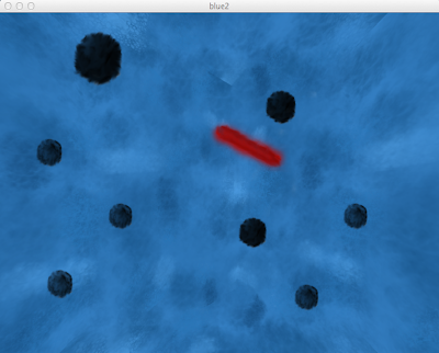
In addition, the skyboxes for each of these textures move in different speeds relative to one another, so the background is continuously changing. Here is the final sketch:


Next Steps and Ideas for Future Work 


  1. Better Blue I, put it on the 3D wall: The 3d version of the painting doesn't look as exact as the original, so maybe the next step would be make it look more like the original. Some of the seams still show when the skyboxes rotate, so we could also figure out a way to get rid of them. We could also study the original painting as well as the artist and use that to better inform our decision about the positions of the objects with respect to one another. Right now they are all random, but maybe we could give more thought to that. One of the suggestions I got was that maybe the artist did not intend the objects to be fuzzy sphere, but rather, black holes. Also, maybe the artist didn't intend the background to be infinitely far away. We could incorporate some of these suggestions and see where that would lead us. 
  2. Create a series of Miro's: We could start out with a 3d painting, and make the objects interactive so that when a viewer clicks on them, they transform themselves and their backgrounds into another Miro. It would be interesting to create such a series of Miro's.
  3. 3D fractal: It would also be interesting to create a 3d fractal skybox. Say the skybox had a fractal texture. Then you could zoom in to a particular point in the pattern, and then if you zoom in enough you would end up with the same background (and skybox) again. 
  4. Art cube of 3d paintings: It would be interesting to create a 3d painting that folds into others like the one in the video here, but from the inside:  

Monday, May 6, 2013

Visualizing DSQ on Facebook with Processing js

For my final project I worked with Angus and Saiph Savage (a phD student at University of Carlifornia, Santa Barbara) to create an interface for visualizing a model for Directed Social Queries on Facebook. Saiph created the LDA topic model which predicted the Facebook friends most likely to answer a user's social query on Facebook based on the likes made by the user's friends.

Usually facebook apps that allow you to ask a query "Who is up for a movie tonight?" return a list of friends that are most likely answer your question. These friends are often accompanied by the top topics they (might) relate to, but the app does not show how it arrived at this conclusion. This visualization enables the user to explore the data and the process through which the model came up with its results.

In the beginning, the interface first shows all the topics related to the user's friends. These include "Television," "Fashion," "Music" etc.


 Rolling over the topics shows the facebook labels and words/tags associated with the topic:


 When the user enters something in the search box, for example, "pizza," the interface shows the top topic (in this case "food") and the top nine friends associated with the query and topic:


Rolling over a friend gives the likes the the friend made that most contribute to the topic. For example, rolling over "Rodrigo Zea" shows likes such as "skittles" and "pringles"


When the user rolls over one of the likes, a sidebar pops up on the left that gives further information about the like:


Lastly, rolling over a topic gives the same information as before the query--words and Facebook labels associated with the like.


Thus this visualization helps the user explore the data and helps them make decisions based on the query. For example, if the user is organizing a charity fashion show, this interface can help them figure out which Facebook friends are most likely to respond to their cause.

Project Evolution 


In my presentation I mostly talked about the experience I had while working on this project with Angus and Saiph. Here's how it evolved: 
a)     Directed Social Queries 
      Earlier, Angus and Saiph had worked on a static version of the visualization, which showed all the data at once for a small number of friends. In this visualization friends could be linked to likes, likes to words, and words to topic. It was also possible to go in the opposite direction as well:


b) First Visualization
      Then we started working on the interface Saiph wanted for her model. The first task in that involved connecting all data (topic, words, likes, topics) to everything else. This gave us the flexibility to visualize the data in whichever way we wanted to. This took the longest time because there were a lot of different types of files and a lot of different types of data.
     When we started visualizing the data, the first visualization we did was to show all friends, and their top three topics.
     Clicking on the friend showed the likes, and clicking on likes showed the words:
   

    Clicking on the top topic lead you to words, followed by likes and friends:


    Our idea was to make each node draggable, and to give the user the ability to pin words/topics/likes/friends that they were interested in. This would give them full freedom to explore the data, and compare with other friends/topics. I even came up with an algorithm to do it, but before we could implement it Saiph said she wanted something really simple in processing js, which is when we switched tracks completely.

 c) First Visualization with Processing js
     The first visualization we did in Processing js was very simple--it just showed the top 50 friends, color-coded according to rank. Rolling over them showed their likes. 


Saiph really liked this one, but she wanted to have more information about the likes and the topics, which is how the final version came to be. 

How it works 


When the search button is pressed, a python script is called, which in turn creates a json file which looks like this:
http://ec2-107-22-157-20.compute-1.amazonaws.com/transparentInterface/transparent.py?question=pizza

Our first task was to pass this data into the Processing sketch.

Passing data from javascript/html to Processing 
The html file (which can be seen by viewing the source code at http://ec2-107-22-157-20.compute-1.amazonaws.com/transparentInterface/) calls a javascript function called doSearchTest(), which in turn
uses the ajax framework to open a XML HTTP request to the json file given above. Since it is on the same server, it does not create a problem with the same origin policy. The ajax code is:

        $.ajax({
           type: 'GET',
           contentType: "application/json",
           dataType: "text",
           url: 'http://ec2-107-22-157-20.compute-1.amazonaws.com/transparentInterface/transparent.py?question='+q,
           success: function(data) {
              formatResultsSC(data,keyword);
   },
        });

On success, this code reads the json file, puts it into a string, and passes it to formatResultsSC(), which in turn calls the processing sketch:

function formatResultsSC(data, keyword) {
        $('#loading').fadeOut();
var pjs = Processing.getInstanceById('DSQ');
             
                pjs.passDataIntoProcessing(data);              
             
        }

Here, pjs is an instance of the processing sketch. The statement pjs.passDataIntoProcessing(data) calls the method in the processing sketch, which looks something like this:

void passDataIntoProcessing (String data) {
    //code to parse the JSON data and make data ready for visualization
    dataIsReady = true;
}

Here dataIsReady is a global variable. The draw method uses this boolean to determine what to draw:

void draw() {
       if(dataIsReady()) {
            for(Friend f: friends) {
               f.render();
            }
            //render all friends and topics
      }
      else {
          //render the topics only
      }
}

Mouse Over functions
The rollover functions are all part of the render() methods in Friend/Topic class. Both these classes look something like this:

public class Friend {
       //instance variables for position of ellipse and name of friend
       int x, y, w, h;
       String friend;
     
       //boolean value to check is mouse is over the friend
       boolean isOver;

      public Friend() {
          //constructor
      }

      public void render() {
          if(isOver) {
               //render friends AND likes
               if( likeIsOverFunc(likeX, likeY)
                   //draw sidebar
          }
           else {
              //render friends only
          }
     }

     likeIsOverFunc(likeX, likeY) checks if the X and Y co-ordinates of the mouse are within the range of the
     likes for the friend.
     The isOver value is changed in the mouseMoved method:
     void mouseMoved() {
          for(Friend f: friends) {
               if(f.isOverFunc()) {
                    f.isOver = true;
               }
          }
     }

(The mouseMoved method also ensures only one friend node is open at any given time, the code for which is not included here).

Passing data from Processing js to javascript 
Another thing the processing sketch does is that clicking on a friend passes the user ID of the friend to the javascript, which adds their profile picture to the bar at the bottom of the visualization. To do this, the Processing sketch has the following code to let it know about the javascript:


interface JavaScript {
      //name of the global javascript function to be called
      void B(String name1, int idNumber);

 }

  void bindJavascript(JavaScript js) {
       javascript = js;
 }
 JavaScript javascript;

The mousePressed() method calls the javascript function:
void mousePressed() {
      for( Friend f: friends) {
           if ( f.isClicked) {
                  //call the javascript function and pass in the data
                   javascript.B ( f.name, f.userID)
           }
       }
}

The javascript code also has to know about the Processing sketch:

 <script type="text/javascript">
        var bound = false;
   
         //This function checks if processing js has loaded the sketch yet. If it has, it tells the sketch what  
        // "javascript" should be. If the sketch is not loaded yet, it checks again after 250 ms.
        function bindJavascript() {
                var pjs = Processing.getInstanceById('DSQ');
                 if(pjs!=null) {
      pjs.bindJavascript(this);
                       bound = true; }
                if(!bound) setTimeout(bindJavascript, 250);
       }
        bindJavascript();

          //this is the global javascript function that is called from the processing sketch
 function B(name1, idNumber) {
      //code for putting profile picture in the bottom bar
   
 }
  </script>

More information about this can be found in this tutorial: http://processingjs.org/articles/PomaxGuide.html#sketchtojs


Thursday, February 21, 2013

Ideas for Art Show

Here are my ideas for the art show. All of these would require a projector, with little to no interaction through mouse or keyboard for the viewer.

1. Sketching of Fernand Leger's Les Disques:
I would use the imitation I created of Fernand Leger's Les Diques (after actually coding all of the "images" from the original) and time it such that each shape comes one by one, telling the narrative of how the piece was created.

2. Live sketching of an art piece
This is similar to the one above, but instead of shapes, this one will draw on a canvas, bringing the drawing into being step by step.

3. Visual music
I would love to do a visual music piece on this song:


 The song has incredible energy and flow, so the visualization should be really interesting to do.

4. Silhouette Garba on "Give me Love" by Ed Sheeran
I'm a Gujarati, and Garba is in my blood (Garba is a traditional dance form in the western part of India, performed during the festival of Navratri). Whenever I listen Ed Sheeran's Give Me Love my feet automatically want to do the steps of Garba because the music is so much like a Garba song. I thought I could create a silhouette, and animate that to visualize the Garba steps I have in my head.

5. Visual Poetry with Graffiti
I wanted to do this for the Visual Poetry assignment but ran out of time. I would put an image of a blank  piece wall in the background, and visualize how a graffiti artist would paint the random poem on the wall. Instead of static backgrounds from google, I will create the backgrounds myself and animate them.

6. Galaxy
I would love to play with 3-D features of processing to create a 3-D galaxy, one that pans and zooms and rotates.

7. Snowfall
All the snowfall yesterday gave me this idea. I could visualize snowfall on Dove Mountain golf course, landing on humongous cacti and other desert shrubbery.

8. Story
Going along with one of my idea for three big projects, I could create an animated piece that tells the story of this song:

9. Supernova
In this piece I would visualize a supernova, how a star collapses on its own gravity and then explodes. Maybe I could find an appropriate piece of music for it too.


Wednesday, February 13, 2013

Three Projects

Here are three projects I'd work on if I had a room for myself, and unlimited resources at my disposal:

1) Maze of Graffiti poems
I got the idea for this from a book called as "Graffiti Moon" by Cath Crowley, in which one of the main characters and his best friend go around painting graffiti on the walls of Sydney in the dead of the night. The paintings are always accompanied by a poem from the best friend, oftentimes making a political statement.

I am enthralled by the idea of finding little surprises like these while walking through a city in the middle of the night.


My project would consist of a maze built into a really large and darkened room. There would be multiple entrances, and the maze would be so large so as to allow the public to see at most 50% of the works before making it to the center (and exit). I want an element of chance to be in it, to really make the public revel in the feeling of being able to see a particular piece, given the design of the maze.

2) Walk through Local group of galaxies
This idea stems through my many visits to science museums and planetariums throughout U.A.E, and also through the astronomy class I took last semester. Again, I'd require a really large room. This project would stimulate a walk through the Local group of galaxies, allowing for interactivity in some way.
It would also stimulate common phenomena like supernovas, black hole accretion , birth of a star, etc. through live models and projections.
See Explanation.  Clicking on the picture will download
 the highest resolution version available.

M82 X-1


3) Storybook room
Stories have always fascinated me, especially the intricate ones. The idea for this stems from visits to the Dubai museum and the Akshardham temple  in Delhi. The Dubai museum is different from other museums in that it tells the story of how Dubai came to be as it is, instead of just presenting artifacts. The visitors have to walk through history itself, past life-sized dioramas of pearl-diving in real, life size dhows, to mud houses in an oasis. The museum depicts every aspect of life in the Dubai of centuries past.

Akshardham does a similar thing, but instead of walking, visitors have to go on a boatride through 50,000 years worth of Indian history. The boat ride is also accompanied by commentary and music.

I'd like to create a storybook room filled with such life-sized dioramas, where the visitors not only hear and see the story, but feel exactly as the characters feel. I want them to feel the rain on their characters faces, the sand on the characters' toes. I want them to feel branches crunch under their boots, and to feel the biting wind that blows through a haunted house.

The story will be narrated to the visitors as they walk through the room, accompanied by music at appropriate places.

Artist Statement

My artwork views the world through a philosophical as well as aesthetic lens. Each of my visual poems is a construction, carefully combining concrete words and abstract images to eternally capture an idea to a wall. I rely heavily on our desire to make sense of the world we live in, our inherent curiosity, and attraction to aesthetic beauty. My artwork is me showing people my solution to this great mystery we call life, one question at a time.
The pieces themselves span a wide range of topics, as diverse as astronomical philosophy, philosophical politics, and holographic introspection. I work from outside-in, always eavesdropping for ideas, experiences, and inspiration in the world around me. Once I have one of these three things, I write the poem and paint the visual poem on paper, often cutting up chunks and rearranging the pieces into a collage. The final draft is always created on a wall.
My biggest inspiration is Sarah Kay, a spoken word poet from New York City. I admire her for her ability to make her audience feel exactly how she feels, at the same time she feels it. I also admire her for her ability to paint abstract vivid images in her audience's minds without once lifting a paintbrush.
It's what I strive for in every one of my works.

Sunday, February 10, 2013

Visual Poetry with Rabindranath Tagore's Fireflies

For this assignment, I chose a paragraph from Old Man And The Sea by Ernest Hemingway as the text and selected lines from Rabindranath Tagore's Fireflies as the template. Here are the lines I chose (each verse is a poem in iteself):

Pearl shells cast up by the sea
on death's barren beach,—
a magnificent wastefulness of creative life.

The lake lies low by the hill,
a tearful entreaty of love
at the foot of the inflexible.

In the drowsy dark caves of the mind
dreams build their nest with fragments
dropped from day's caravan.

In the mountain, stillness surges up
to explore its own height;
in the lake, movement stands still
to contemplate its own depth.

Life's errors cry for the merciful beauty
that can modulate their isolation
into a harmony with the whole.

The cloud gives all its gold
to the departing sun
and greets the rising moon
with only a pale smile.

Wishing to hearten a timid lamp
great night lights all her stars.

For each verse, I created a template and saved it in the "grammar files" folder. Here's how my program generates poems:

1) It first creates a hashmap of arraylists for different parts of speech by parsing words.txt (which I manually created from the text).

2) Then it randomly picks a template from the "grammar files" folder. 

3) For that template, it uses the POS tag as a key to access the above hashmap and create a poem.

4) For the poem, it checks for certain nouns and randomly picks a background from that arrayList. For example, if the poem contains the words "moon" and "sea", it chooses from 5 different possible backgrounds.

5) When the mouse is pressed, it generates a new poem and corresponding background. 

Here are some examples:


Here's the link to the zip folder. I couldn't put it on processing.js because I used BufferedReader.


Sunday, January 20, 2013

MoMA artist assignment

The piece I chose for this assignment is called Les Disques by Fernand Leger. It is an oil painting that uses abstract geometric figures (mainly disks and rectangles) to create a cityscape depicting the view from a railroad car. The disks are meant to represent wheels and the slanting vertical rectangles are meant to represent shafts. There are also many human appearances (engineers on the left and conductors in the middle) despite it being made solely of geometric figures. The painting mostly uses earth colors like ocher, brown, orange, and green. It also uses a lot of gray scale colors, which makes sense as it depicts machinery. Here's the piece:


 The painting was created in 1918, toward the end of World War 1. It is the first in a series of many paintings which center around the theme of "disks". The artist, Fernand Leger, spent the last three years of the war "in the French army's engineer corps" (MoMA website), which was where he got the inspiration for this piece. He firmly believed in the relationship between man and the machine. He called the people in his Disk series Homo faber, or "Man the maker", who then became protagonists in his mechanical universe (collectionsonline.lacma.org).

My immediate aesthetic response to this piece (and the reason I chose to do it) was that it was so colorful. The use of thick borders to highlight certain shapes, along with the contrast of the colorful disks to the gray scale shafts really make the piece stand out.

I think this piece is successful because it shows how even though man has created something bigger than himself, he still manages to control it. This is shown by the way humans are depicted--small, in a huge mechanical world, but in controlling positions.

I think the painting's interpretation is inverted today as compared to when it came out. At that time, technology had just started becoming a part of people's daily lives (especially with the implementation of the assembly line in creating automobiles). Man had created a huge clockwork world, but he was still in charge of it.

Today, man is surrounded even more so by technology. But instead of us controlling it, it controls us. Apart from being completely dependent on our laptops/macbooks/phones/iPads for almost everything, our entire existence depends on technology. If by some random chance (this is just a thought experiment, I really have no idea if this is even possible), the sun were to emit a solar flare with such an intense electromagnetic field that all computers stopped working , it'd be as close to apocalypse as we're ever going to get. Banks, transport, stock markets, governments, and everything else that depends on computers will stop working and our whole world would come to a standstill. How then can we say that we control the technology we created?

Here is my attempt to emulate the piece. The zip file containing the project can be downloaded here.